# CSS 基础之布局(下)
# 两列布局
# 左列定宽,右列自适应
方法一:利用 float + margin 实现
原理:将左框脱离文档流,右框向右移动一定的距离(左框的宽度 + 左右框之间的间隙宽度),以达到视觉上的两列布局。
html 代码:
<div class="container">
  <div class="left">左列定宽</div>
  <div class="right">右列自适应</div>
</div>
2
3
4
css 代码:
.left {
  width: 100px;
  height: 500px;
  float: left;
  background-color: #f00;
}
.right {
  height: 500px;
  margin-left: 120px; /* .left的宽度 + 间隔 */
  background-color: #0f0;
}
2
3
4
5
6
7
8
9
10
11
- 优点:简单,易理解。
- 缺点:兼容性存在一定问题,IE6 下有 3px 的 bug。右框下的 p 清除浮动将产生 bug。
方法二:利用 float + margin(fix) 实现
原理:在方法一的基础上,通过向右框添加一个父框,左框和右父框 float 属性使之产生 BFC 以去除 bug。
html 代码:
<div class="container">
  <div class="left">左列定宽</div>
  <div class="right-fix">
    <div class="right">右列自适应</div>
  </div>
</div>
2
3
4
5
6
css 代码:
.left {
  width: 100px;
  height: 500px;
  float: left;
  background-color: #f00;
}
.right-fix {
  width: 100%;
  float: right;
  margin-left: -100px; /* 正值等于.left的宽度,才能显示在同一行 */
}
.right {
  height: 500px;
  margin-left: 120px; /* .left的宽度 + 间隔 */
  background-color: #0f0;
}
2
3
4
5
6
7
8
9
10
11
12
13
14
15
16
- 优点:简单,易理解
方法三:使用 float + overflow 实现
原理:将左边框脱离文档流,设置右边 overflow 属性以触发 BFC。
html 代码:
<div class="container">
  <div class="left">左列定宽</div>
  <div class="right">右列自适应</div>
</div>
2
3
4
css 代码:
.left {
  width: 100px;
  height: 200px;
  float: left;
  margin-right: 20px; /* 左右边框间隙,需要定义在.left中 */
  background-color: #f00;
}
.right {
  height: 200px;
  overflow: hidden; /* 触发 bfc 达到自适应 */
  background-color: #0f0;
}
2
3
4
5
6
7
8
9
10
11
12
- 优点:代码简单,容易理解,无需关注定宽的宽度,利用 BFC 达到自适应效果。
- 缺点:浮动脱离文档流,需要手动清除浮动,否则会产生高度塌陷;不支持 IE6。
方法四:使用 table 实现(不推荐)
原理:通过将父框设置为表格,将左右边框转化为类似于同一行的 td,从而达到两列布局。
html 代码:
<div class="container">
  <div class="left">左列定宽</div>
  <div class="right">右列自适应</div>
</div>
2
3
4
css 代码:
.container {
  width: 100%; /* 需设置宽度,否则table的尺寸会根据内容宽度而定 */
  height: 200px;
  display: table;
  table-layout: fixed; /* 列宽由表格宽度和列宽度设定,与单元格的内容无关 */
}
.left {
  width: 100px;
  background-color: #f00;
}
.right {
  padding-left: 20px; /* 间隔 */
  background-color: #0f0;
}
.left,
.right {
  display: table-cell; /* 利用单元格自动分配宽度 */
}
2
3
4
5
6
7
8
9
10
11
12
13
14
15
16
17
18
- 优点:代码简单,容易理解,无需关注定宽的宽度,利用单元格自动分配达到自适应效果。
- 缺点:margin 失效;设置间隔比较麻烦;不支持 IE6、IE7 。
方法五:使用绝对定位实现
原理:父元素相对定位,子元素绝对定位,当绝对定位元素没有明确指定宽度,且 left、right 同时设置 时,子元素将会左右无限延伸占满父元素空间。
html 代码:
<div class="container">
  <div class="left">左列定宽</div>
  <div class="right">右列自适应</div>
</div>
2
3
4
css 代码:
.container {
  position: relative; /* 父相对定位 */
}
.left {
  width: 100px;
  height: 200px;
  position: absolute; /* 子绝对定位 */
  top: 0;
  left: 0;
  background-color: #f00;
}
.right {
  height: 200px;
  position: absolute; /* 子绝对定位 */
  top: 0;
  left: 120px; /* .left的宽度 + 间隔 */
  right: 0; /* 关键!!!向右无限延伸占满父元素空间 */
  background-color: #0f0;
}
2
3
4
5
6
7
8
9
10
11
12
13
14
15
16
17
18
19
- 优点:代码简单,容易理解。
- 缺点:浮动脱离文档流,需要关注定宽的宽度。
方法六:使用 flex 实现
原理:通过设置 CSS3 布局利器 flex 中的 flex 属性以达到两列布局。
html 代码:
<div class="container">
  <div class="left">左列定宽</div>
  <div class="right">右列自适应</div>
</div>
2
3
4
css 代码:
.container {
  height: 200px;
  display: flex;
}
.left {
  width: 100px;
  margin-right: 20px; /* 间隔 */
  background-color: #f00;
}
.right {
  flex: 1; /* 均分了父元素剩余空间 */
  background-color: #0f0;
}
2
3
4
5
6
7
8
9
10
11
12
13
- 优点:功能强大,简单方便。
- 缺点:PC 端兼容性不好,低版本浏览器(IE6、IE7、IE8)不支持,移动端(Android4.0+)。
方法七:使用 Grid 实现
原理:暂不清楚。
html 代码:
<div class="container">
  <div class="left">左列定宽</div>
  <div class="right">右列自适应</div>
</div>
2
3
4
css 代码:
.container {
  width: 100%;
  height: 200px;
  display: grid;
  grid-template-columns: 100px auto; /* 设定2列就ok了,auto换成1fr也行 */
}
.left {
  background-color: #f00;
}
.right {
  margin-left: 20px; /* 间隔 */
  background-color: #0f0;
}
2
3
4
5
6
7
8
9
10
11
12
13
优点:代码简单,容易理解。
缺点:
# 左列不定,右列自适应
方法一:使用 float + overflow 实现
方法同左列定宽,左列不设宽度即可。
方法二:使用 flex 实现
方法同左列定宽,左列不设宽度即可。
方法三:使用 Grid 实现
原理:暂不清楚。
html 代码:
<div class="container">
  <div class="left">左列不定</div>
  <div class="right">右列自适应</div>
</div>
2
3
4
css 代码:
.container {
  width: 100%;
  height: 200px;
  display: grid;
  grid-template-columns: auto 1fr; /* auto和1fr换一下顺序就是左列自适应,右列不定宽了 */
}
.left {
  background-color: #f00;
}
.right {
  margin-left: 20px; /* 间隔 */
  background-color: #0f0;
}
2
3
4
5
6
7
8
9
10
11
12
13
优点:代码简单,容易理解。
缺点:
# 定宽+自适应+两列等高
方法一:使用 float + overflow + padding 补偿法实现
原理:通过过分加大左右子元素的高度,辅助超出隐藏,以达到视觉上的等高。当左右子元素内容高度不同时,用 padding-bottom 来补偿这部分高度差。
在左列定宽右列自适应 float + margin 的基础上,增加以下 CSS 代码:
.container {
  overflow: hidden; /* 创建BFC */
}
.left,
.right {
  padding-bottom: 9999px; /* 左右子元素无限增大,撑大父元素 */
  margin-bottom: -9999px; /* 与padding-bottom的正值相抵消,恢复父元素大小 */
}
.left {
  width: 100px;
  height: 500px;
  float: left;
  background-color: #f00;
}
.right {
  height: 500px;
  margin-left: 120px; /* .left的宽度 + 间隔 */
  background-color: #0f0;
}
2
3
4
5
6
7
8
9
10
11
12
13
14
15
16
17
18
19
- 优点:兼容性好。
- 缺点:伪等高,不是真正意义上的等高。
方法二:使用 table 实现
方法同左列定宽右列自适应
方法三:使用 flex 实现
方法同左列定宽右列自适应
方法四:使用 display 实现
原理:
html 代码:
<div class="container">
  <div class="left">
    <p>left</p>
  </div>
  <div class="right">
    <p>right</p>
    <p>right</p>
  </div>
</div>
2
3
4
5
6
7
8
9
css 代码:
.container {
  width: 100%;
  display: -webkit-box;
}
.left {
  width: 100px;
  margin-right: 20px; /* 间隔 */
}
.right {
  -webkit-box-flex: 1;
}
2
3
4
5
6
7
8
9
10
11
- 缺点:兼容性存在较大的问题。
# 三列布局
# 两列定宽,右列自适应
方法同左列定宽右列自适应。
# 两列不定,右列自适应
方法同左列不定右列自适应。
# 两侧定宽,中间自适应
# 方法一:圣杯布局
html 代码:
<div class="container">
  <div class="center">中间自适应</div>
  <div class="left">左列定宽</div>
  <div class="right">右列定宽</div>
</div>
2
3
4
5
假设左侧的固定宽度为 200px,右侧的固定宽度为 150px,则首先在 container 上设置:
.container {
  padding-left: 200px;
  padding-right: 150px;
  box-sizing: border-box;
}
2
3
4
5
为左右两列预留出相应的空间,得到如下示意图:

随后分别为三列设置宽度与浮动,同时清除浮动对其他元素的影响:
.container:after {
  content: "";
  display: table;
  clear: both;
}

.center {
  width: 100%;
  height: 200px;
  float: left;
  background-color: #d6d6d6;
}

.left {
  width: 200px;
  height: 200px;
  float: left;
  background-color: #66bbe2;
}

.right {
  width: 150px;
  height: 200px;
  float: left;
  background-color: #ff5800;
}
2
3
4
5
6
7
8
9
10
11
12
13
14
15
16
17
18
19
20
21
22
23
24
25
26
得到如下效果:

根据浮动的特性,由于 .center 的宽度为 100%,即占据了第一行的所有空间,所以 .left 和 .right 被“挤”到了第二行。
接下来的工作是将 .left 放置到之前预留出的位置上,这里使用**负外边距(nagetive margin)**:
.left {
  width: 200px;
  height: 200px;
  float: left;
  margin-left: -100%;
  background-color: #66bbe2;
}
2
3
4
5
6
7
得到:

随后还需要使用**定位(position)**方法,将 .left 的位置在原有位置基础上左移 200px,以完成 .left 的放置:
.left {
  width: 200px;
  height: 200px;
  float: left;
  margin-left: -100%;
  position: relative;
  right: 200px;
  background-color: #66bbe2;
}
2
3
4
5
6
7
8
9
这里使用 position: relative 和 right: 200px ,得到如下效果:

接下来放置 .right,只需添加一条声明即可:
.right {
  width: 150px;
  height: 200px;
  float: left;
  margin-right: -150px;
  background-color: #ff5800;
}
2
3
4
5
6
7
得到最终的效果图:

至此,布局效果完成。不过还需要考虑最后一步,那就是页面的最小宽度:要想保证该布局效果正常显示,由于两侧都具有固定的宽度,所以需要给定页面一个最小的宽度,但这并不只是简单的 200 + 150 = 350px。回想之前 .left 使用了 position: relative ,所以就意味着在 .center 开始的区域,还存在着一个 .left 的宽度。所以页面的最小宽度应该设置为 200 + 150 + 200 = 550px:
.container {
  min-width: 550px;
}
2
3
综上所述,圣杯布局的 CSS 代码为:
body {
  min-width: 550px;
}
.container {
  padding-left: 200px;
  padding-right: 150px;
  box-sizing: border-box;
}

.container:after {
  content: "";
  display: table;
  clear: both;
}

.center {
  width: 100%;
  height: 200px;
  float: left;
  background-color: #d6d6d6;
}

.left {
  width: 200px;
  height: 200px;
  float: left;
  margin-left: -100%;
  position: relative;
  right: 200px;
  background-color: #66bbe2;
}

.right {
  width: 150px;
  height: 200px;
  float: left;
  margin-right: -150px;
  background-color: #ff5800;
}
2
3
4
5
6
7
8
9
10
11
12
13
14
15
16
17
18
19
20
21
22
23
24
25
26
27
28
29
30
31
32
33
34
35
36
37
38
39
在
.center中,包含了一条声明width: 100%,这是中间列能够做到自适应的关键。可能会有朋友认为不需要设置这条声明,因为觉得.center在不设置宽度的情况下会默认将宽度设置为父元素(.container)的 100% 宽度。但需要注意到,.center是浮动元素,由于浮动具有包裹性,在不显式设置宽度的情况下会自动“收缩”到内容的尺寸大小。如果去掉width: 100%,则当中间列不包含或者包含较少内容时,整个布局会“崩掉”,而达不到这样的效果。
- 优点:利用布局,可优先渲染主体部分;不需要添加 DOM 节点。
- 缺点:当浏览器缩小到一定程度,使得
.center宽度小于.left时,将会发生布局错乱,所以需要设置最小宽度。
# 方法二:双飞翼布局
双飞翼布局的 DOM 结构与圣杯布局的区别是在中间列创建了 inner 放置内容。
html 代码:
<div class="container">
  <div class="center">
    <div class="inner">中间自适应</div>
  </div>
  <div class="left">左列定宽</div>
  <div class="right">右列定宽</div>
</div>
2
3
4
5
6
7
按照与圣杯布局相同的思路,首先设置各列的宽度与浮动,并且为左右两列预留出空间,同时清除浮动对其他元素的影响:
.container:after {
  content: "";
  display: table;
  clear: both;
}

.center {
  width: 100%;
  height: 200px;
  float: left;
  background-color: #d6d6d6;
}

/* 新增inner元素 */
.inner {
  margin-left: 100px;
  margin-right: 200px;
}

.left {
  width: 200px;
  height: 200px;
  float: left;
  background-color: #66bbe2;
}

.right {
  width: 150px;
  height: 200px;
  float: left;
  background-color: #ff5800;
}
2
3
4
5
6
7
8
9
10
11
12
13
14
15
16
17
18
19
20
21
22
23
24
25
26
27
28
29
30
31
32
以上代码将 .center、.left、.right设置为float: left,而在 .center内部,.inner由于没有设置浮动,所以其宽度默认为 .center 的 100% 宽度,通过对其设置 margin-left 和 margin-right 为左右两列预留出了空间。
将.left、.right 放置到预留位置:
.left {
  width: 200px;
  height: 200px;
  float: left;
  margin-left: -100%;
  background-color: #66bbe2;
}

.right {
  width: 150px;
  height: 200px;
  float: left;
  margin-left: -150px;
  background-color: #ff5800;
}
2
3
4
5
6
7
8
9
10
11
12
13
14
15
最后计算最小页面宽度:由于双飞翼布局没有用到 position:relative 进行定位,所以最小页面宽度应该为 200 + 150 = 350px。但是当页面宽度缩小到 350px 附近时,会挤占中间列的宽度,使得其内容被右侧栏覆盖,因此在设置最小页面宽度时,应该适当增加一些宽度以供中间列使用。
.container {
  min-width: 500px;
}
2
3
至此双飞翼布局大功告成!其布局整体 CSS 代码为:
.container {
  min-width: 500px;
}

.container:after {
  content: "";
  display: table;
  clear: both;
}

.center {
  width: 100%;
  height: 200px;
  float: left;
  background-color: #d6d6d6;
}

/* 新增inner元素 */
/* 这是双飞翼和圣杯最明显的区别,在center内部使用的是margin,而圣杯是直接在container部分使用padding */
.inner {
  margin-left: 100px;
  margin-right: 200px;
}

.left {
  width: 200px;
  height: 200px;
  float: left;
  margin-left: -100%;
  background-color: #66bbe2;
}

.right {
  width: 150px;
  height: 200px;
  float: left;
  margin-left: -150px;
  background-color: #ff5800;
}
2
3
4
5
6
7
8
9
10
11
12
13
14
15
16
17
18
19
20
21
22
23
24
25
26
27
28
29
30
31
32
33
34
35
36
37
38
39
优点:利用布局,可优先渲染主体部分;不会像圣杯布局那样变形。
缺点:多加了一层 DOM 节点。
# 方法三:流体布局
原理:利用浮动产生的高度坍塌实现布局。
html 代码:
<div class="container">
  <div class="left">左列定宽</div>
  <div class="right">右列定宽</div>
  <div class="center">中间自适应</div>
</div>
2
3
4
5
css 代码:
.container {
  min-width: 200px;
}
.left {
  width: 100px;
  height: 200px;
  float: left;
  background-color: #f00;
}
.center {
  height: 200px;
  margin-left: 100px;
  margin-right: 100px;
  background-color: #eeff2b;
}
.right {
  width: 100px;
  height: 200px;
  float: right;
  background-color: #0f0;
}
2
3
4
5
6
7
8
9
10
11
12
13
14
15
16
17
18
19
20
21
优点:代码简单,容易理解。
缺点:DOM 结构中.center 主体部分需要放在非主体 .left 和 .right 之后。
# 方法四:使用绝对定位实现
原理:
html 代码:
<div class="container">
  <div class="center">中间自适应</div>
  <div class="left">左列定宽</div>
  <div class="right">右列定宽</div>
</div>
2
3
4
5
css 代码:
.container {
  position: relative; /*父相对定位*/
}
.left {
  width: 100px;
  height: 200px;
  position: absolute; /* 子绝对定位 */
  top: 0;
  left: 0;
  background-color: #f00;
}
.center {
  height: 200px;
  margin-left: 100px; /* 大于等于.left的宽度,或者给.container添加同样大小的padding-left */
  margin-right: 100px; /* 大于等于.right的宽度,或者给.container添加同样大小的padding-right */
  background-color: #eeff2b;
}
.right {
  width: 100px;
  height: 200px;
  position: absolute; /* 子绝对定位 */
  top: 0;
  right: 0;
  background-color: #0f0;
}
2
3
4
5
6
7
8
9
10
11
12
13
14
15
16
17
18
19
20
21
22
23
24
25
- 优点:容易理解,兼容性比较好。
- 缺点:脱离文档流,两侧高度无法撑起父元素高度;如果中间列设置了
min-width,或是内部含有定宽的元素,当浏览器宽度缩小到一定程度时,会发生层重叠的情况。
# 方法五:使用 table 实现
Html 代码:
<div class="container">
  <div class="left">左列定宽</div>
  <div class="center">中间自适应</div>
  <div class="right">右列定宽</div>
</div>
2
3
4
5
css 代码:
.container {
  width: 100%;
  height: 200px;
  display: table;
}
.left {
  width: 100px;
  display: table-cell;
  background-color: #f00;
}
.center {
  display: table-cell;
  background-color: #eeff2b;
}
.right {
  width: 200px;
  display: table-cell;
  background-color: #0f0;
}
2
3
4
5
6
7
8
9
10
11
12
13
14
15
16
17
18
19
- 优点:代码简洁,容易理解;
- 缺点:margin 失效,设置间隔比较麻烦;不支持 ie8-
# 方法六:使用 flex 实现
html 代码:
<div class="container">
  <div class="left">左列定宽</div>
  <div class="center">中间自适应</div>
  <div class="right">右列定宽</div>
</div>
2
3
4
5
css 代码:
.container {
  height: 200px;
  display: flex;
}
.left {
  width: 100px;
  background-color: #f00;
}
.center {
  flex: 1; /* 均分.container剩余的空间 */
  background-color: #eeff2b;
}
.right {
  width: 200px;
  background-color: #0f0;
}
2
3
4
5
6
7
8
9
10
11
12
13
14
15
16
- 优点:功能强大,简单方便。
- 缺点:无法实现主体部分优先渲染;PC 端兼容性不好,低版本浏览器(IE6、IE7、IE8)不支持,移动端(Android4.0+)。
# 方法七:使用 Grid 实现
原理:暂不清楚。
html 代码:
<div class="container">
  <div class="center">中间自适应</div>
  <div class="left">左列定宽</div>
  <div class="right">右列定宽</div>
</div>
2
3
4
5
css 代码:
.container {
  height: 200px;
  display: grid;
  grid-template-columns: 100px auto 200px; /*设定3列*/
  /*设置网格区域分布*/
  grid-template-areas: "leftside main rightside";
}

.left {
  grid-area: leftside;
  background-color: #f00;
}
.center {
  grid-area: main; /*指定在哪个网格区域*/
  margin: 0 15px; /*设置间隔*/
  background-color: #eeff2b;
}
.right {
  grid-area: rightside; /*指定在哪个网格区域*/
  background-color: #0f0;
}
2
3
4
5
6
7
8
9
10
11
12
13
14
15
16
17
18
19
20
21
优点:利用布局,可优先渲染主体部分;
缺点:兼容性不好;
# 等宽布局

公式转化:
l = w * n + g * (n-1) => l = w * n + g * n - g => l + g = (w + g) * n
2
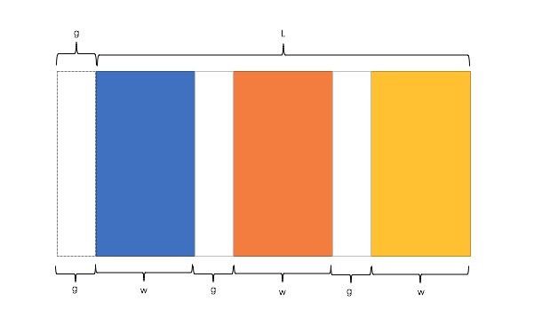
因此,我们需要解决两个问题:
- 如何让总宽度增加 g(即:L+g)
- 如何让每个宽包含 g(即:w+g)
方法一:使用 float + padding 实现
原理:增大父框的实际宽度后,使用 CSS3 属性 box-sizing 进行布局的辅助。
html 代码:
<div class="container">
  <div class="column"><p>1</p></div>
  <div class="column"><p>2</p></div>
  <div class="column"><p>3</p></div>
  <div class="column"><p>4</p></div>
</div>
2
3
4
5
6
css 代码:
.container {
  margin-left: -20px; /* l增加g */
}
.column {
  float: left;
  width: 25%;
  padding-left: 20px; /* 间隔g */
  box-sizing: border-box; /* 宽度包含padding区域 w+g */
}
2
3
4
5
6
7
8
9
- 优点:代码简单,容易理解;兼容性较好。
- 缺点:IE6、IE7 百分比兼容存在一定问题;需要手动清除浮动,否则会产生高度塌陷。
方法二:使用 table + padding 实现
原理:通过增加一个父框的修正框,增大其宽度,并将父框转换为 table,将子框转换为 tabel-cell 进行布局。
html 代码:
<div class="container-fix">
  <div class="container">
    <div class="column"><p>1</p></div>
    <div class="column"><p>2</p></div>
    <div class="column"><p>3</p></div>
    <div class="column"><p>4</p></div>
  </div>
</div>
2
3
4
5
6
7
8
css 代码:
.container-fix {
  margin-left: -20px; /* l增加g */
}
.container {
  display: table;
  width: 100%;
  table-layout: fixed;
}
.column {
  display: table-cell; /* 无需关注列数,单元格自动平分 */
  padding-left: 20px; /* 间隔g */
}
2
3
4
5
6
7
8
9
10
11
12
- 优点:代码简单,容易理解;无需关注宽度。单元格自动等分。
- 缺点:增加了一层;margin 失效;不兼容 IE6 和 IE7。
方法三:使用 flex 实现
原理:通过设置 CSS3 布局利器 flex 中的 flex 属性以达到等分布局。
html 代码:
<div class="container">
  <div class="column"><p>1</p></div>
  <div class="column"><p>2</p></div>
  <div class="column"><p>3</p></div>
  <div class="column"><p>4</p></div>
</div>
2
3
4
5
6
css 代码:
.container {
  display: flex;
}
.column {
  flex: 1; /* 无需关注列数,一起平分.container */
}
.column + .column {
  /* 选取.column后直接相邻的.column兄弟元素 */
  margin-left: 20px; /* 间隔 */
}
2
3
4
5
6
7
8
9
10
- 优点:代码量少,与块数无关
- 缺点:PC 端兼容性不好,低版本浏览器(IE6、IE7、IE8)不支持,移动端(Android4.0+)。
方法四:使用 Grid 实现
原理:暂不清楚。
html 代码:
<div class="container">
  <div class="column"><p>1</p></div>
  <div class="column"><p>2</p></div>
  <div class="column"><p>3</p></div>
  <div class="column"><p>4</p></div>
</div>
2
3
4
5
6
css 代码:
.container {
  margin-left: -20px; /* l增加g */
  display: grid;
  grid-template-columns: repeat(4, 1fr); /* 4就是列数 */
}
.column {
  margin-left: 20px; /* 间隔 */
}
2
3
4
5
6
7
8
- 优点:
- 缺点: